MealMind
App design for positive health goals
Project Overview
Problem: Many Americans aged 40-59 find themselves trapped in a cycle of dieting — losing weight only to regain it. This pattern can negatively impact both their physical and mental health.
Solution: I created MealMind, an app designed to help individuals aged 40-59 break free from the dieting cycle and focus on positive health goals. The app provides insights into users' relationship with food and offers personalized guidance to support lasting positive change.
Project Type: Case Study
|
Timeline: 12 weeks | 2023
Role: Lead UI/UX Designer
Tools: Figma, Figjam, Canva, Google Sheets, Otter AI
DESIGN PROCESS
DESIGN PROCESS
Quantitative Research
I conducted secondary research to to assess the impact and severity of the diet cycle. I found the following relevant information:
| 17.1% of American adults, equivalent to about 57 million people, are on a diet on any given day.
| 66.6% often face weight regain.
| 52.4% of American adults that diet are between the ages of 40-59.
User Research Summary
As nearly half of those caught in the dieting cycle fall between the ages of 40-59, I interviewed three individuals within that age range actively involved in dieting. The aim was to gain deeper insights into behaviors, motivations, and pain points related to dieting—specifically, understanding their current approaches, the reasons behind persistent dieting efforts, and the challenges they encounter in the process.
I discovered a prevalent theme among all participants—they held a negative perception of dieting. Choosing to delve deeper into this theme, I uncovered a supporting study suggesting that improving the perception of dieting contributes to better weight maintenance. This insight guided my decision to move forward with a focus on reshaping perceptions.
Persona
From the themes and insights gathered from the interviews, I created my target user. Below, you'll find a snapshot detailing her pain points, behaviors, motivations, and a concise summary.
User Stories & Epics
With the help of Sophia, I developed 27 user stories centered on improving perceptions of dieting. To deepen my insights, I reviewed psychology studies to uncover key factors that promote a positive mindset around diet and food
I categorized my user stories into six epics: learn, track, set, schedule, connect, and discover. I specifically prioritized tracking as it best aligns with the goal of reshaping users’ perceptions of dieting, providing a meaningful way for individuals to assess their current mindset and identify opportunities for potential change.
Key User Story
As a user who experienced weight regain, I want to track what foods I am eating along with my feelings so that I can assess which foods makes me feel good and bad.
Screen Development
After defining the main task flow, I explored potential solutions. Drawing inspiration from UI components and features in apps like Duolingo and Noom, I sketched different concepts. These sketches were then translated into wireframes. Below is a glimpse of my screen development process.
UI Inspo
Sketch
Wireframe
User Testing
I conducted two rounds of user testing on the mid-fi wireframe, with five individuals each. I organized notes for each participant and compiled an overarching analysis for each task. I developed a design prioritization matrix, categorizing input by user value and effort. I made several minor adjustments, addressing insights from this testing round—fixing formatting, spacing, and sizing issues. Below is an example of a formatting issue I resolved:
Before
After
Additionally, I encountered a more significant challenge where users didn't grasp how my current design effectively addressed their weight-related concerns. Recognizing that my initial design's emphasis on mood wasn't the primary concern, I redirected the focus towards users' food choices and their associated emotions. As a result, I added a dedicated food tracking screen and designed onboarding screens to guide new users in navigating the app effectively.
Branding
While developing the brand identity, I concentrated on how users would interact with the app and the atmosphere I wanted to evoke. The goal was to inspire motivation and empowerment throughout their weight maintenance journeys. To achieve this, I identified keywords to convey the desired emotions. These terms formed the basis for a moodboard, guiding choices in colors and typography that maintain consistency throughout the app's branding. Below shows an 8-grid-specimen for MealMind:
Hi-Fi Mockups
Below are the tasks listed along with associated screens for a clear understanding of the app's functionality.
| Onboarding
When the app is first downloaded, it will prompt the user to create an account and answer a few demographic and goal-related questions. Afterward, the app presents a tutorial, shown below.
| Log Food Journal
Click the plus icon to add to the food journal. The user will be prompted to add their meal and answer mood-related questions based on their meal.
Home Screen
Add meal
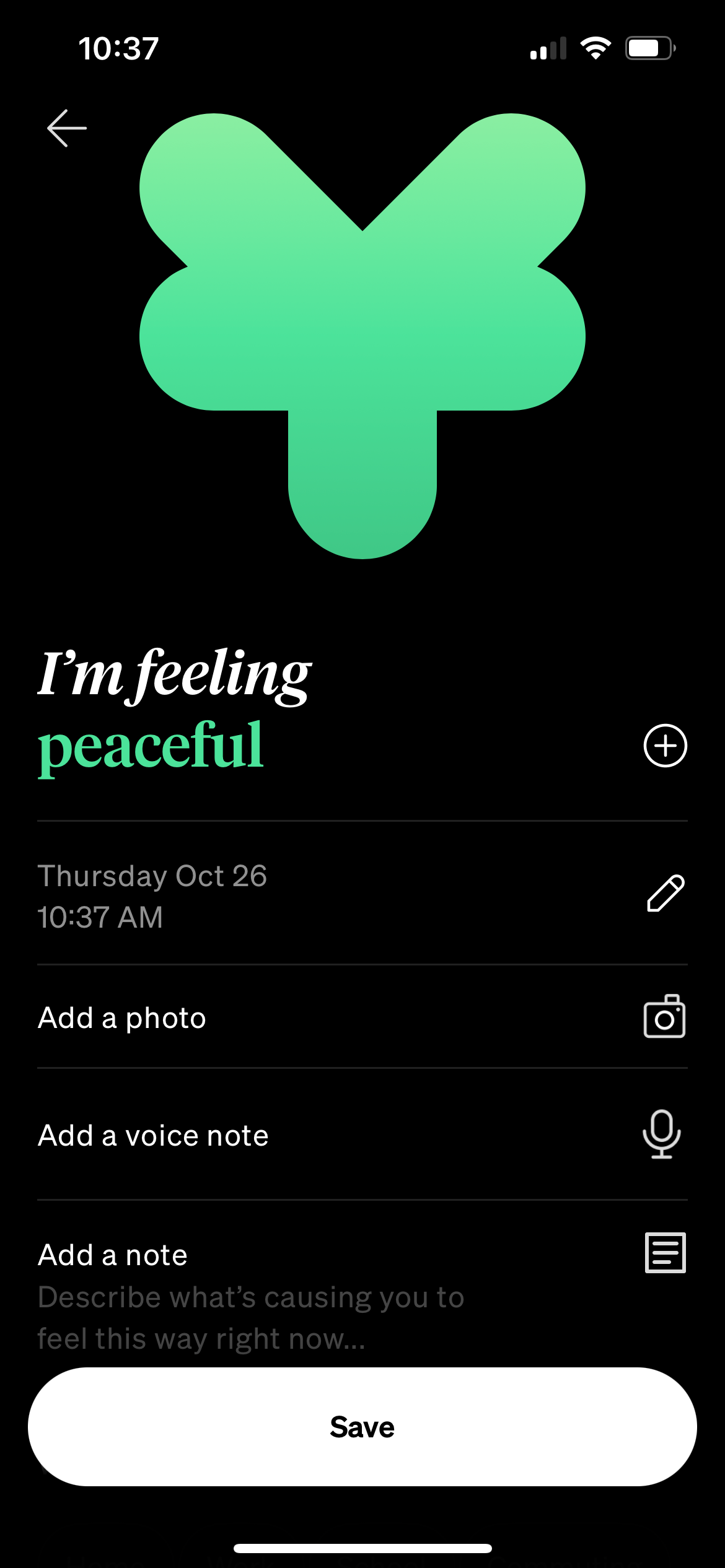
Answer mood-related questions based on meal
Receive overview & insights based on food journal
Get recommendations on insights
Tutorial on tracking meal
Splash Screen
Tutorial on personalized insights
Tutorial on tracking mood
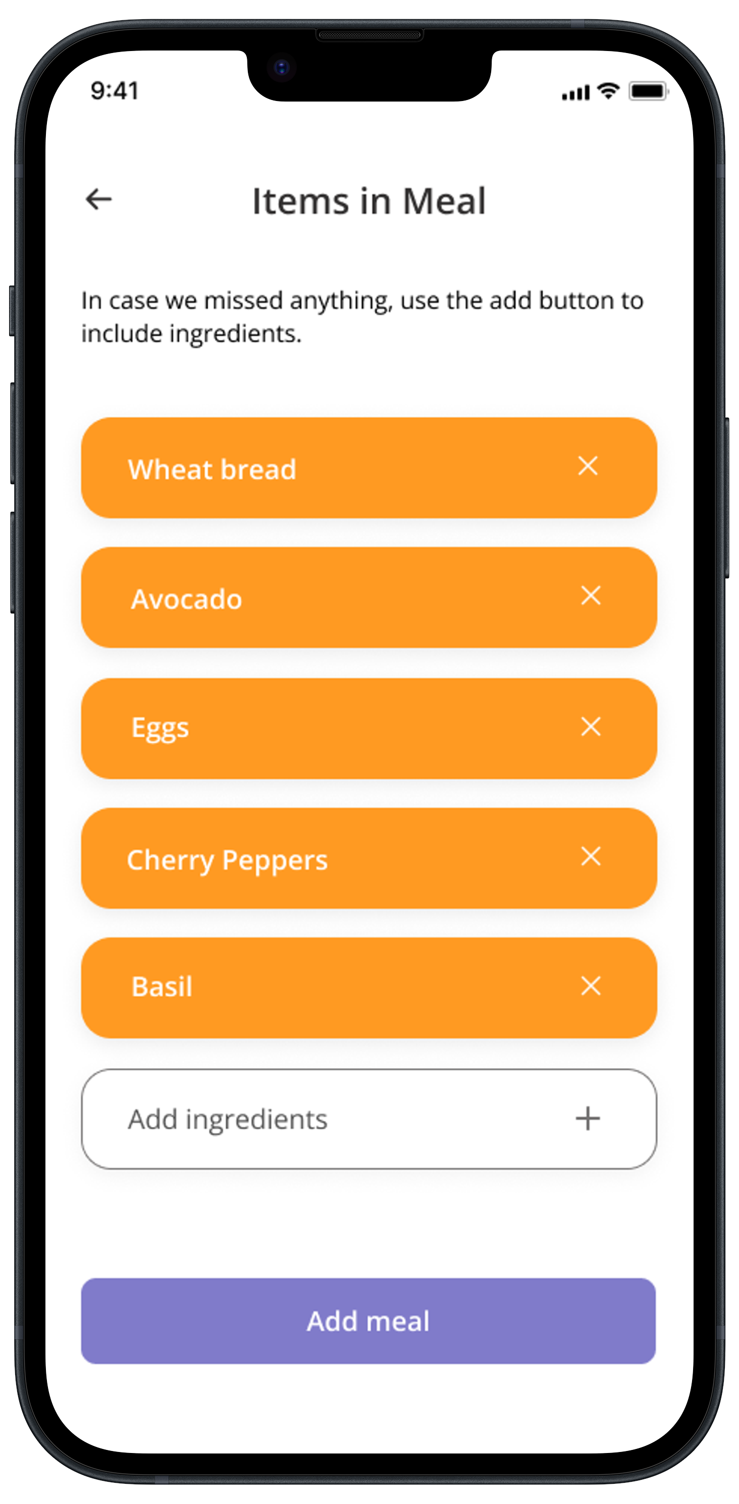
Verify ingredient accuracy
Scan meal
| Receive Personalized Recommendations
The app utilizes artificial intelligence (AI) to analyze the food journal, providing insights into the user's relationship with food and mood. The system then offers personalized information and recommendations based on these insights.
Reflection
At the start of this project, I felt pressured to make my design perfect, treating it as though it were permanent and unchangeable. Ironically, this mindset contradicted the UX design process. Embracing continuous testing and iteration has been invaluable, helping me let go of perfectionism. With ongoing user testing, I'm now better equipped to create a truly useful app that resonates with a wide audience, beyond my own opinions and biases.


